Understanding the basics of upstroke and downstroke lettering is essential for anyone interested in calligraphy, hand lettering, or modern typography. These fundamental strokes form the foundation of beautiful lettering styles and greatly influence the overall aesthetic of written text. Mastery of upstroke and downstroke techniques can transform simple writing into expressive, elegant art. Whether you are a beginner exploring lettering for the first time or an experienced artist refining your style, knowing how to control these strokes will improve your skill and creative possibilities. This topic delves into what upstrokes and downstrokes are, their importance in lettering, and practical tips to help you develop precision and consistency.
What Are Upstroke and Downstroke in Lettering?
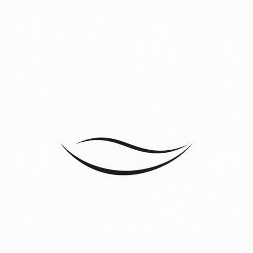
Upstroke and downstroke refer to the direction and pressure of pen or brush movement while forming letters. These strokes are the building blocks of most calligraphy styles, especially modern brush lettering and cursive scripts.
Upstroke Explained
An upstroke is the movement of the pen or brush from the bottom to the top of a letter or shape. It is typically a lighter, thinner stroke created with less pressure. Upstrokes contribute to the delicate and airy parts of a letter, giving it elegance and flow.
Downstroke Explained
A downstroke moves the pen or brush from top to bottom. This stroke is heavier and thicker because it involves applying more pressure. Downstrokes form the bold, dominant parts of letters that provide structure and contrast.
Why Are Upstroke and Downstroke Important?
The contrast between thin upstrokes and thick downstrokes is what gives hand lettering its dynamic and visually appealing quality. This variation in line thickness helps letters stand out and creates rhythm and movement on the page. Without this contrast, lettering can look flat and monotonous.
Impact on Readability and Style
- Legibility: Proper stroke balance ensures letters are clear and easy to read.
- Aesthetic Appeal: Stroke contrast adds beauty and character to writing.
- Expressiveness: Manipulating stroke pressure conveys emotion and personality.
In traditional calligraphy and modern lettering, mastering upstroke and downstroke control is key to achieving professional results.
Tools for Practicing Upstroke and Downstroke Lettering
Choosing the right tools can make practicing these strokes more effective and enjoyable. Various pens, brushes, and digital tools offer unique ways to develop your skills.
Brush Pens
Brush pens are popular for lettering because their flexible tips allow natural variation in pressure, making it easier to create thin upstrokes and thick downstrokes. Brands like Tombow and Pentel offer high-quality brush pens suited for beginners and professionals alike.
Calligraphy Nibs and Dip Pens
Traditional dip pens with flexible nibs require careful pressure control but provide excellent feedback for learning stroke dynamics. They can produce fine upstrokes and bold downstrokes with practice.
Markers and Fineliners
While markers have less pressure sensitivity, you can simulate stroke contrast by varying speed and angle. Fineliners are great for practicing the shapes of letters and understanding stroke flow.
Digital Tools
Tablets and styluses with pressure sensitivity allow digital artists to mimic real brush strokes. Software like Procreate and Adobe Fresco offer brush tools that respond to pressure changes.
Techniques to Master Upstroke and Downstroke Lettering
Consistency in stroke thickness and smooth transitions are the hallmarks of skilled lettering. The following techniques help build muscle memory and precision.
Pressure Control
The most critical aspect is learning to apply light pressure during upstrokes and heavier pressure on downstrokes. Practicing on scrap paper by slowly moving your pen upward and downward helps develop this sensitivity.
Speed and Movement
Upstrokes should be slow and deliberate to keep the line thin and clean, while downstrokes benefit from steady, confident pressure. Avoid rushing, as smoothness impacts stroke quality.
Angle of the Pen
Holding your pen or brush at a consistent angle influences stroke thickness. Experiment with different angles to find what works best for creating clean contrasts between upstrokes and downstrokes.
Practice Drills
- Thin Upstroke Lines: Draw many thin upward lines focusing on light pressure.
- Thick Downstroke Lines: Practice heavier downward strokes keeping them smooth and even.
- Combining Strokes: Alternate thin upstrokes and thick downstrokes to mimic letter shapes.
- Letter Formation: Write simple letters emphasizing stroke pressure differences.
Common Mistakes and How to Avoid Them
Beginners often encounter challenges when learning upstroke and downstroke lettering. Recognizing and correcting these mistakes leads to faster improvement.
Applying Too Much Pressure on Upstrokes
This results in uneven thickness and disrupts the contrast. Focus on using minimal pressure when lifting the pen upward.
Inconsistent Stroke Widths
Uneven thicknesses can make lettering look amateurish. Practice slow, steady strokes and maintain consistent pressure.
Jagged or Wobbly Lines
Unsteady hands or rushing can cause shaky strokes. Work on controlled, smooth movements and build confidence gradually.
Ignoring Pen Angle
Changing the pen angle mid-stroke can alter thickness unexpectedly. Maintain a steady angle for uniform results.
Applications of Upstroke and Downstroke Lettering
The skills of creating thin upstrokes and thick downstrokes extend beyond calligraphy into various creative fields.
Hand Lettering and Invitations
Custom wedding invitations, greeting cards, and posters often use these techniques to create elegant and personalized designs.
Logo Design and Branding
Many brands employ custom lettering with dynamic strokes to convey uniqueness and professionalism.
Art Journals and Scrapbooking
Lettering adds artistic flair to personal projects, allowing expression through style and form.
Social Media and Digital Content
Content creators use upstroke and downstroke lettering to produce eye-catching visuals that stand out in crowded feeds.
Mastering upstroke and downstroke lettering is a fundamental step toward becoming proficient in calligraphy and hand lettering. By understanding the differences in pressure, direction, and technique, artists can bring their letters to life with rhythm and beauty. Through consistent practice with the right tools and techniques, anyone can develop the skill to create stunning lettering that balances thin, graceful upstrokes with bold, confident downstrokes. Whether for personal enjoyment or professional design work, these strokes are the heart of expressive and impactful typography.